
The best and worst new logos of 2021 (so far)
by Alphageek
Wednesday, May 29, 2024
We’re eight months into the year 2021 and we have some unbelievable changes in the world of branding. Here at Alphageek, we love seeing (and creating) a great new logo and we love throwing our unsolicited opinion at some of the biggest changes in the game.
Ready to see some of the best and worst rebranding’s so far this year?
Let’s go!
Burger King
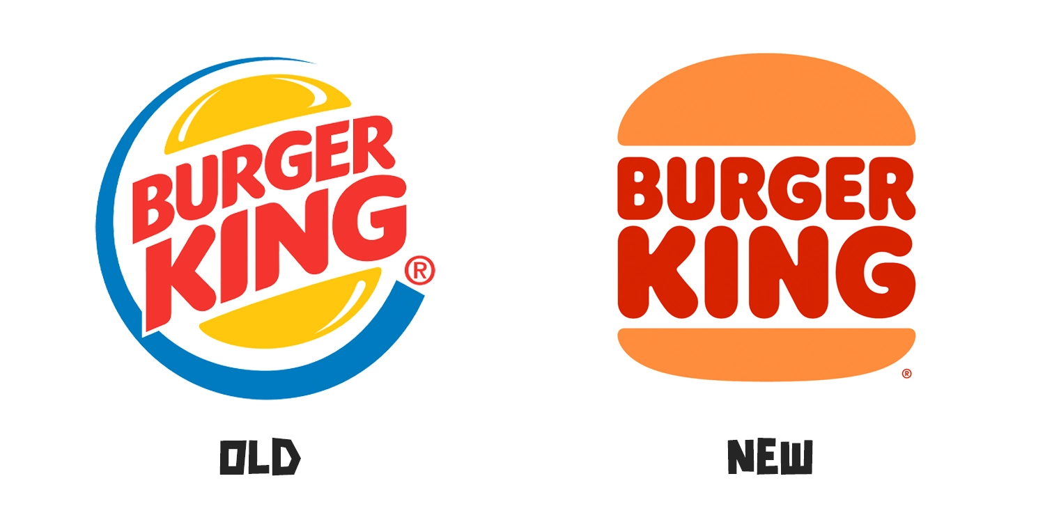
You probably saw this one coming, right? Easily the biggest rebranding of the year and arguably in Burger King’s history. Their new logo perfectly balances and executes two established trends – minimalism and nostalgia. It’s safe to say, Burger King and JKR absolutely killed it with this one.
It’s hard to not comment on their new colour palette too… I’ve never seen brown look so good.
10/10
Pringles
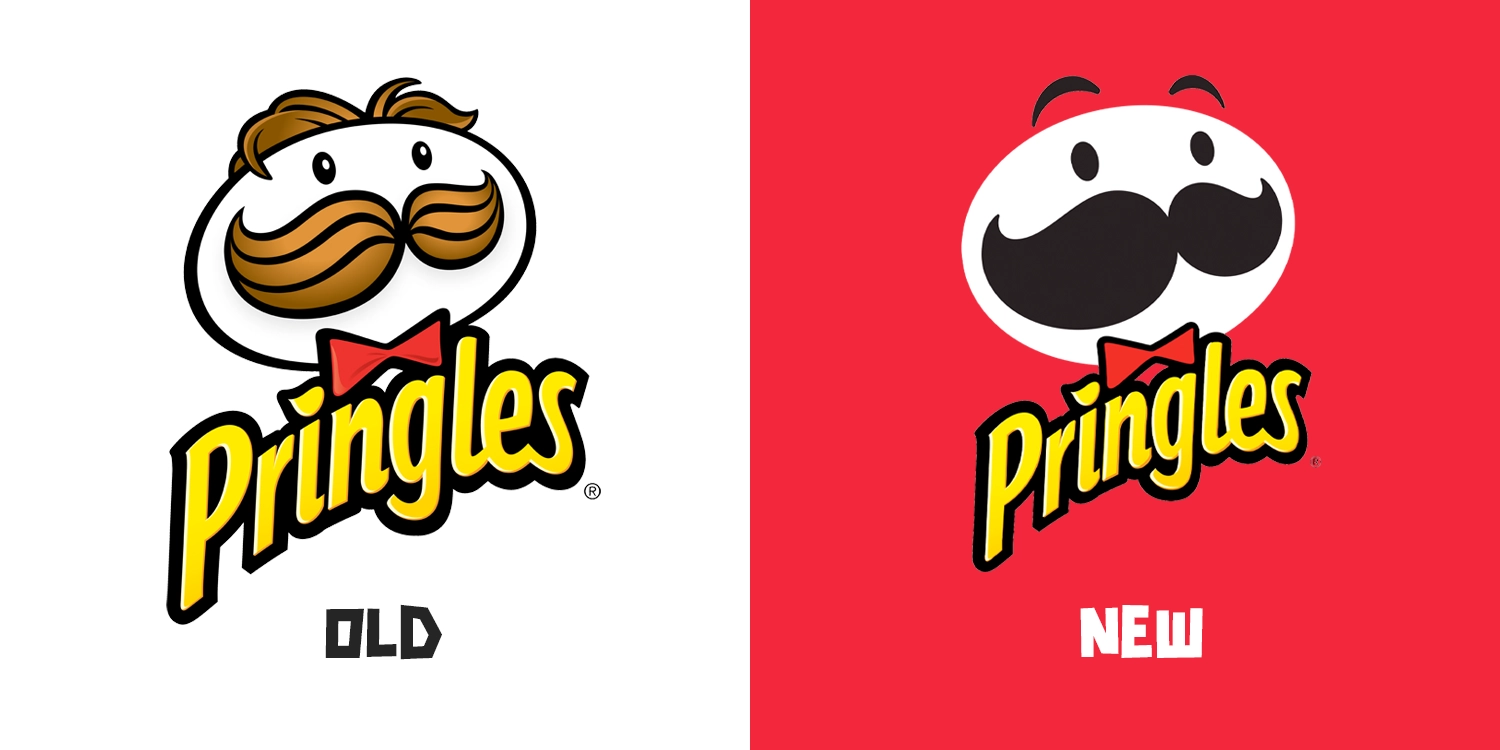
Well… we were praising minimalism a second ago, but this may too far. Look at how they massacred our boy. The idiom “if it isn’t broke, don’t fix it” comes to mind here.
Luckily for us in the UK, this new look hasn’t been rolled out yet, and we’re hoping it doesn’t (Sorry, Pringles)
3/10
Inter (Inter Milan)
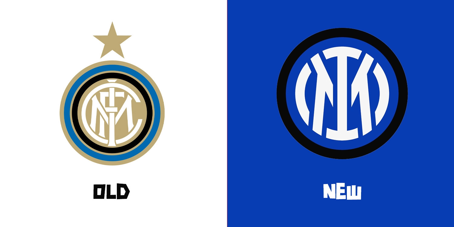
Football fans aren’t usually receptive to change, so this rebrand has been fun to watch. The Milan-based club hopped on the minimalism trend and altered their iconic logo. Honestly, I think it’s a good shift. Removing the FC from the original design, allows for an easier viewing experience. Not only that, but replacing the clashing blue and beige with a bold black contrast is a great upgrade. Great job, Bureau Borsche!
7/10
Vimto
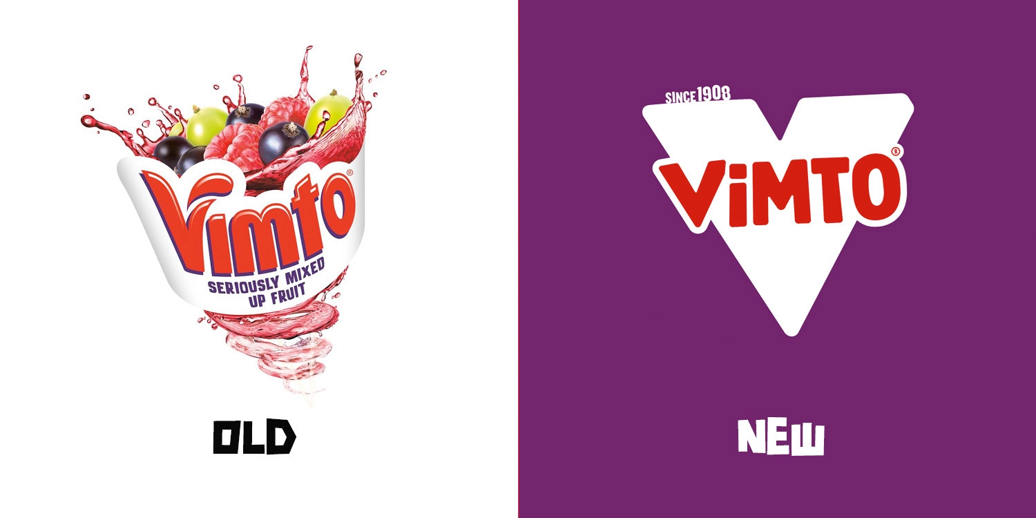
A reoccurring theme, the new Vimto logo redesign is a nostalgic yet minimalist hybrid. Their new-look hopes to revitalise the soft drink, however in the process, has seemingly lost a bit of its personality. The large V may stand out on the shelf, but I fear it may not be for the right reasons.
4/10
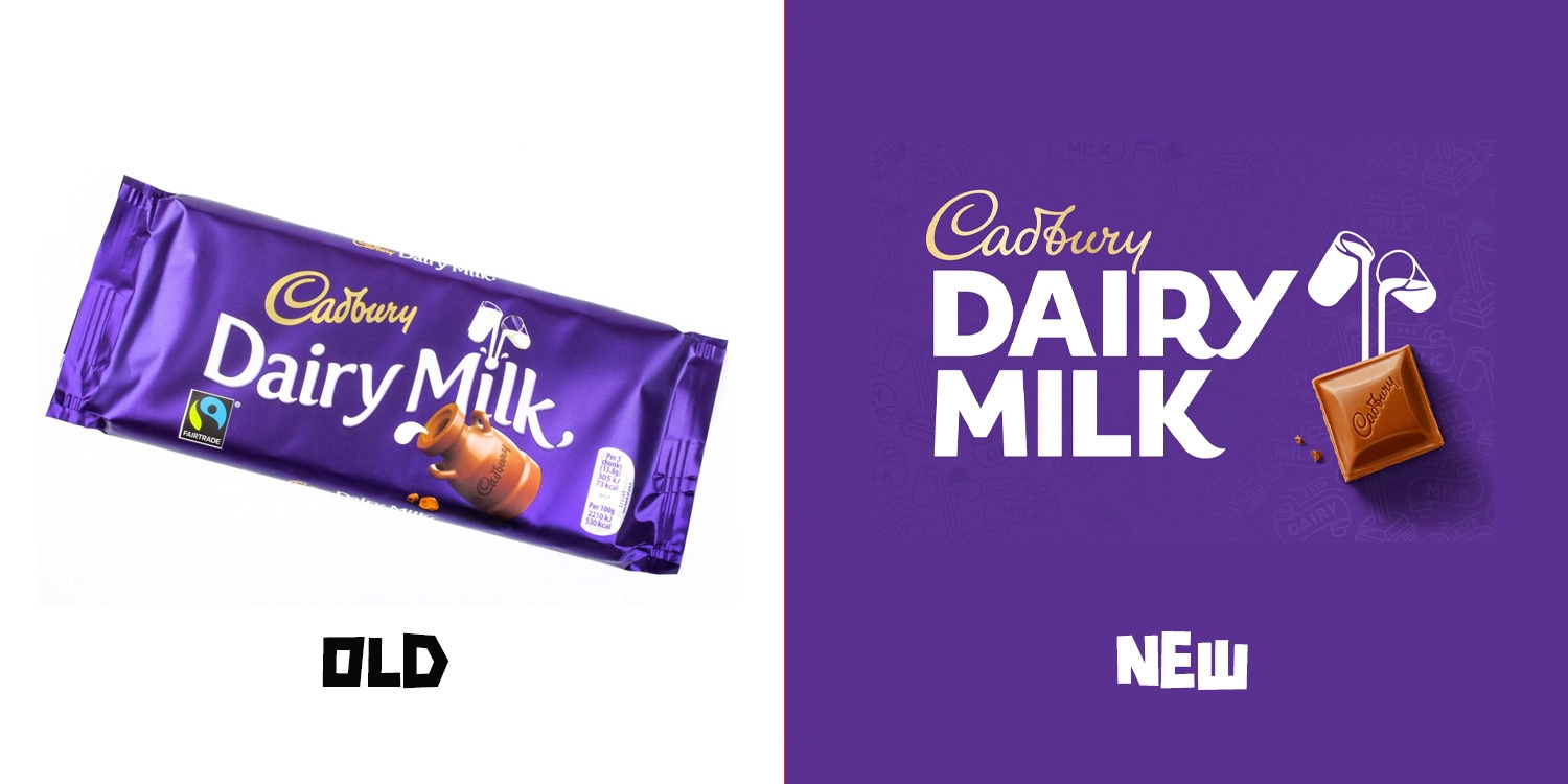
Cadbury Dairy Milk
Two words – bold and beautiful. Lead by Bulletproof, the brand-new branding is the perfect way to modernise a century-old prestigious brand. It’s simplistic yet so elegant at the same time.
Their branding was already standout, but I feel like this refresh is a huge upgrade – it’s certainly caught my eye a few times and I’m not their desired target audience – a sign of great branding.
9/10
Rebranding Themes and Trends
- Flexibility and Legibility. Brands want you to be able to easily read and remember their logo. They also want to place their branding everywhere, that explains their simplistic approach
- Minimalism and Nostalgia. Nostalgia is a key trend right now and it’s seemingly effective. Burger King showed that. Minimalism also continues to be a trend, however, for the price of flexibility and legibility may come the cost of losing brand personality.
- Flat Design. All the above brands showcase a minimal flat style of design. No longer are the days of bevel or 3D styling. Is that a bad thing? Not always!
Do you need a new logo?
Feeling like a refresh? Any of these logos inspired you to update your branding? We offer a professional branding service perfectly tailored for your wants and needs. Interested? Get in touch.

